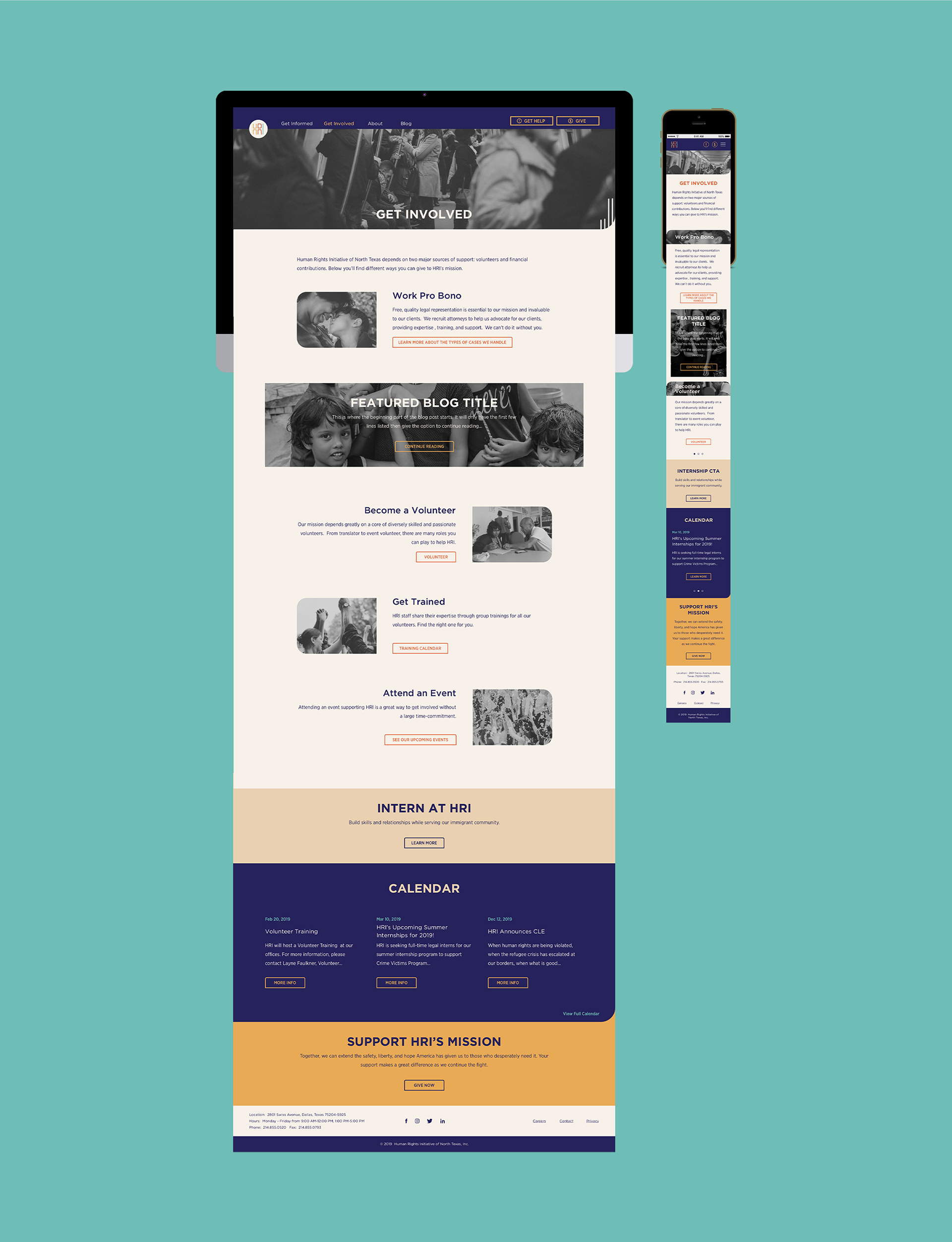
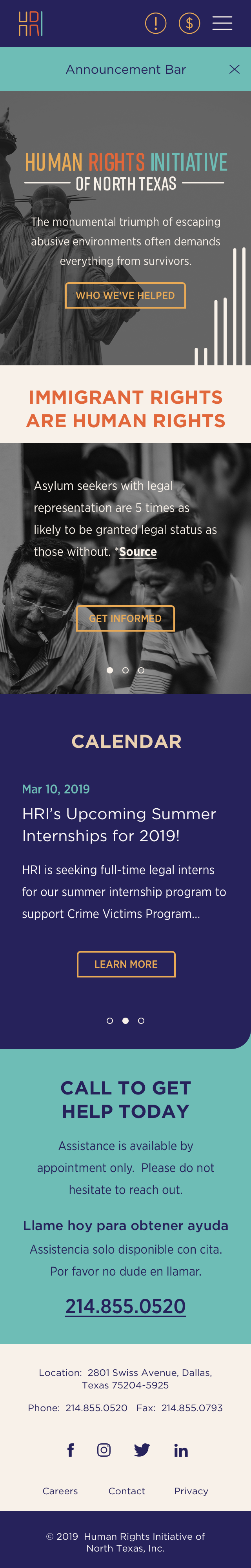
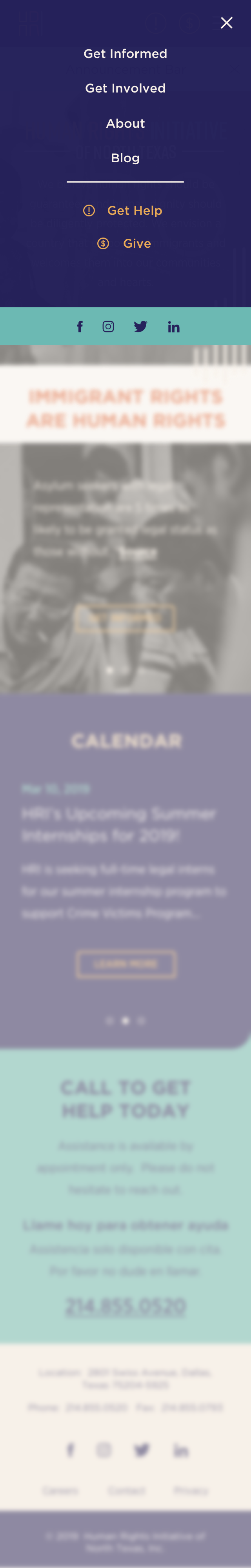
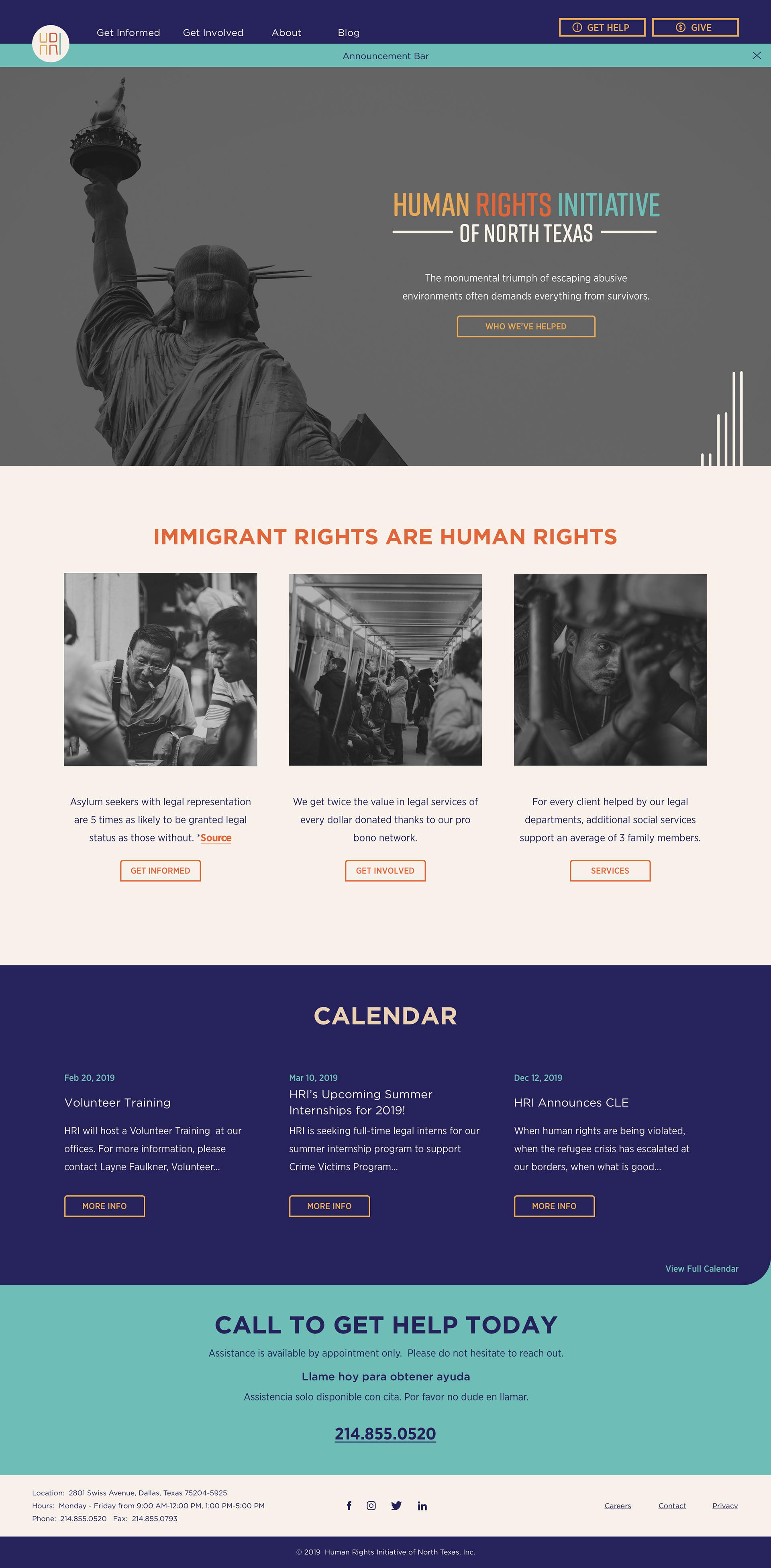
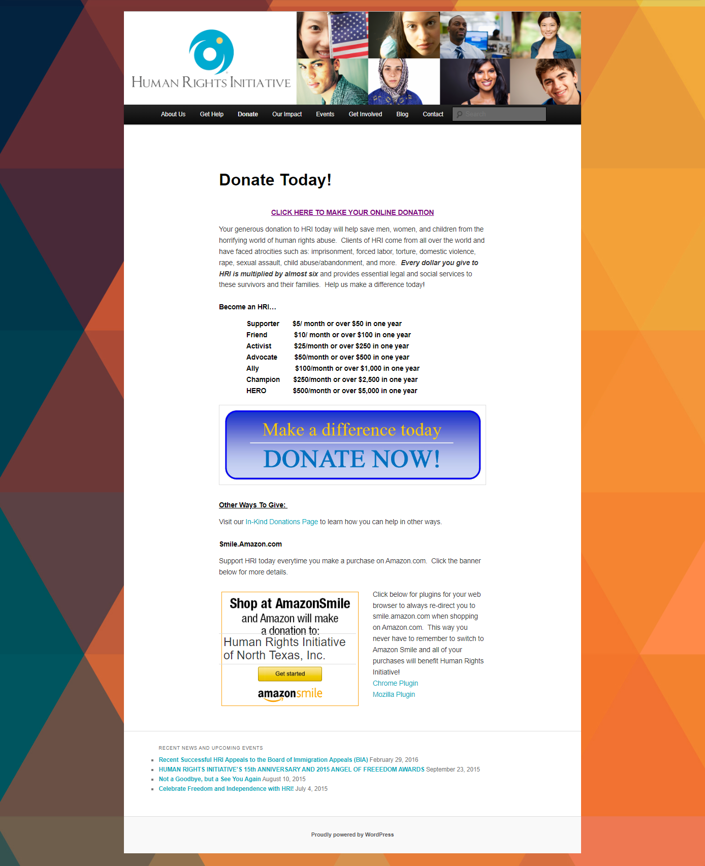
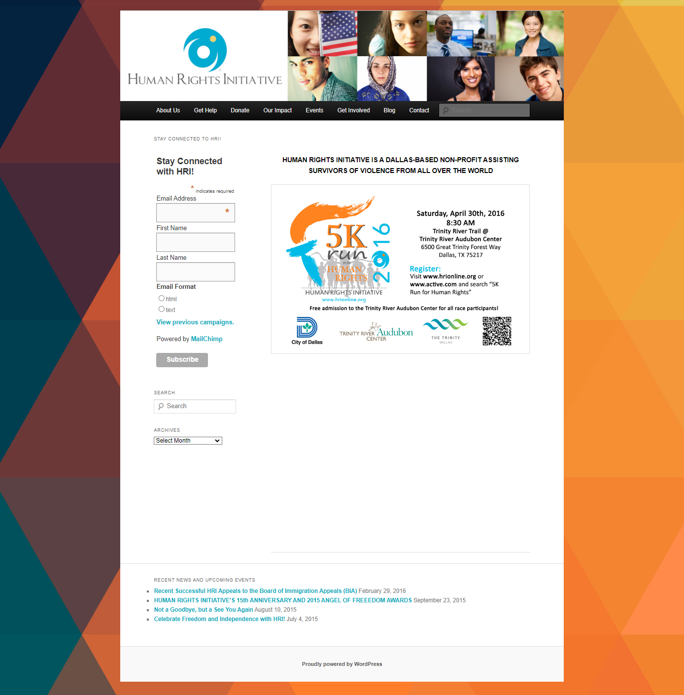
HRI Website
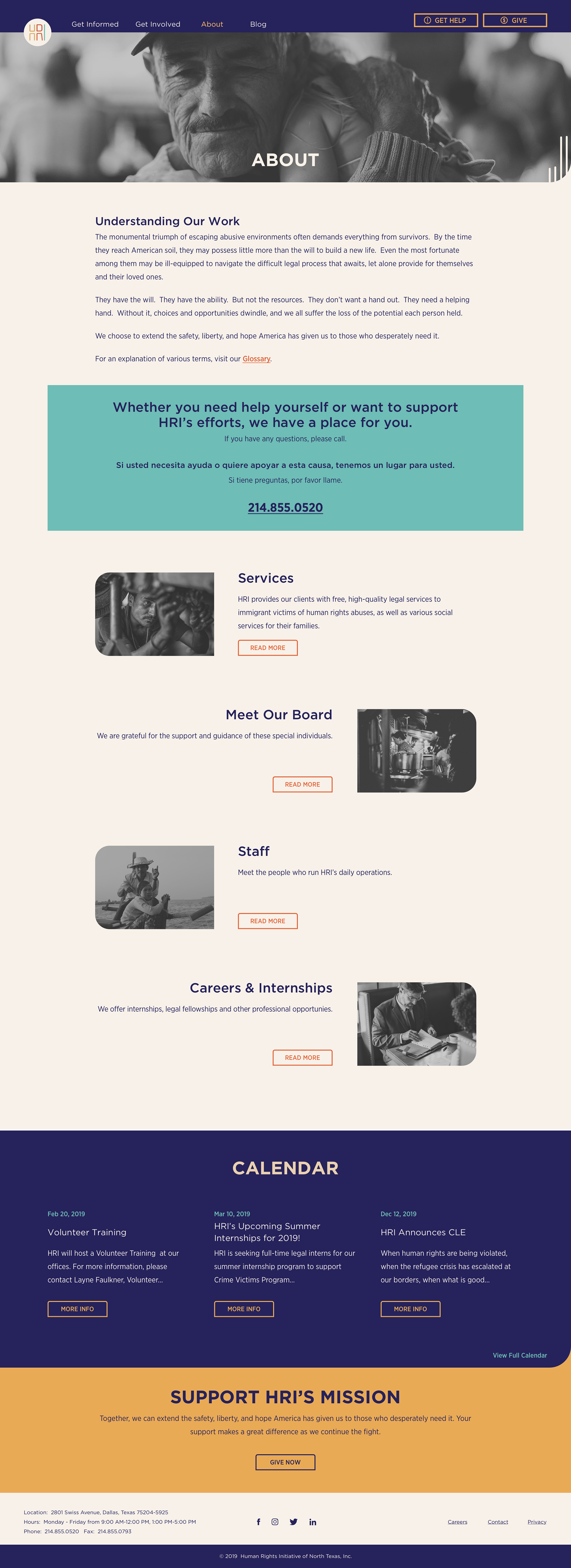
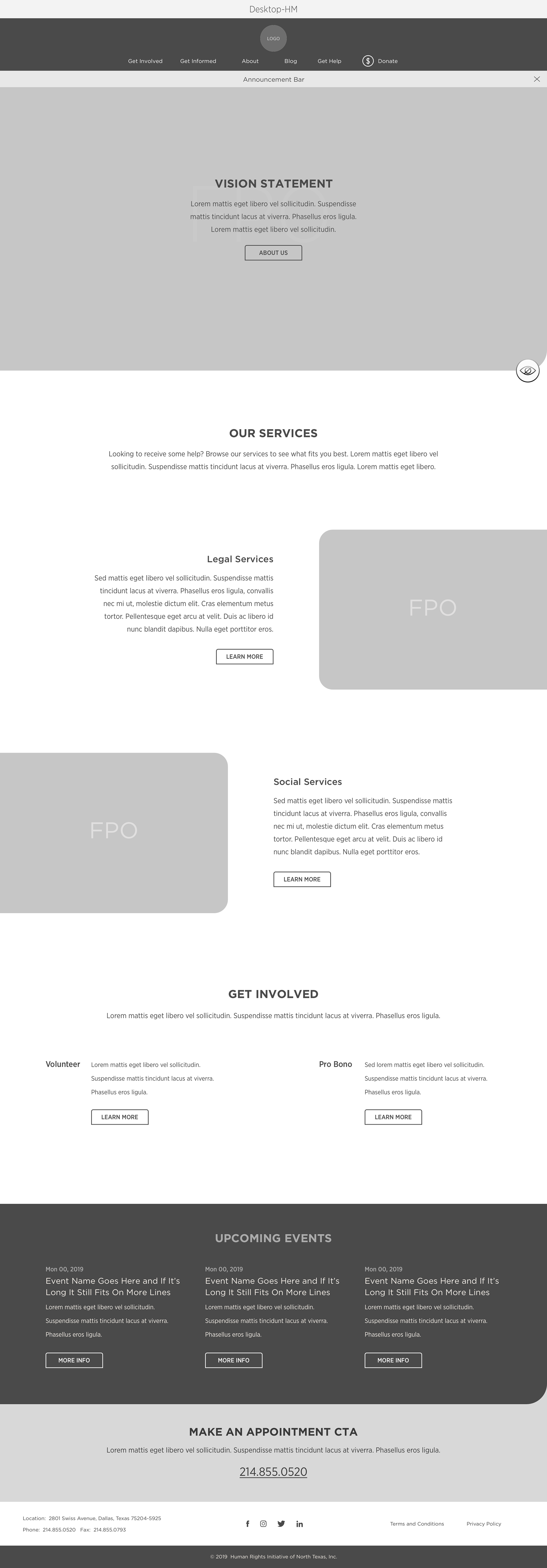
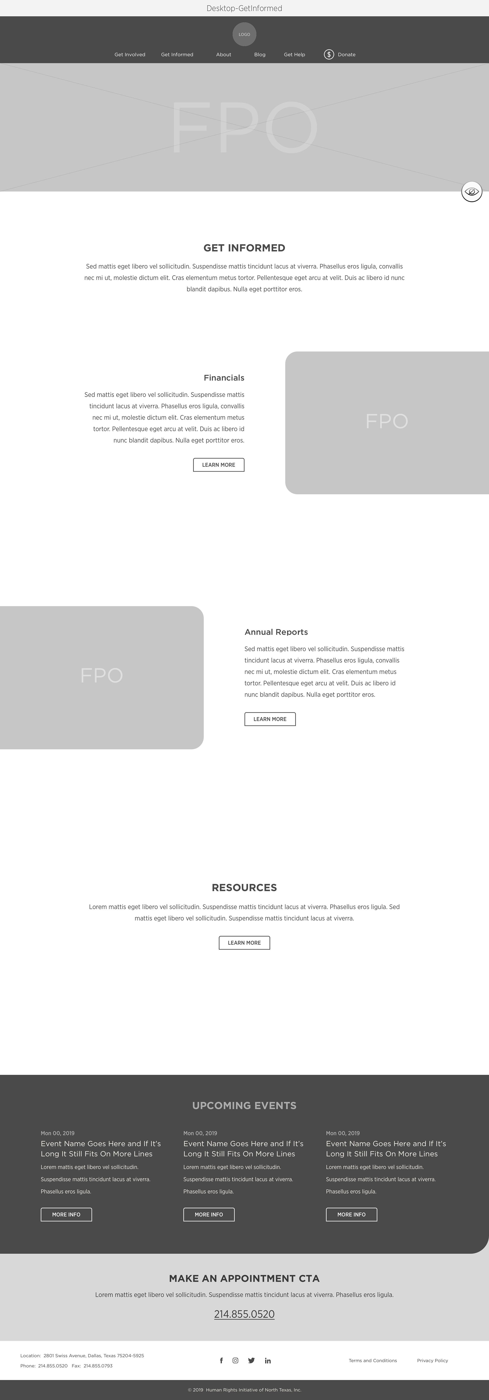
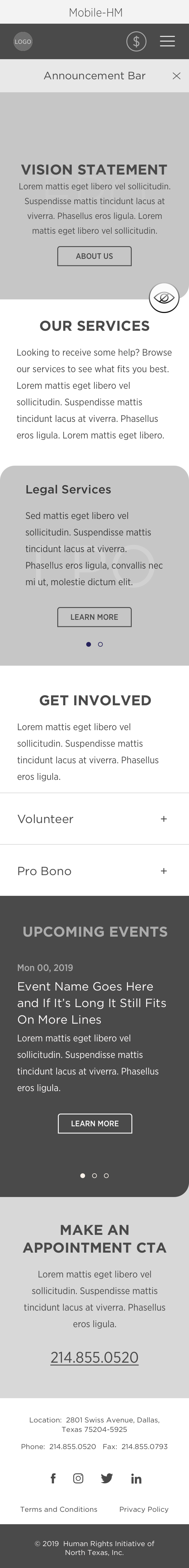
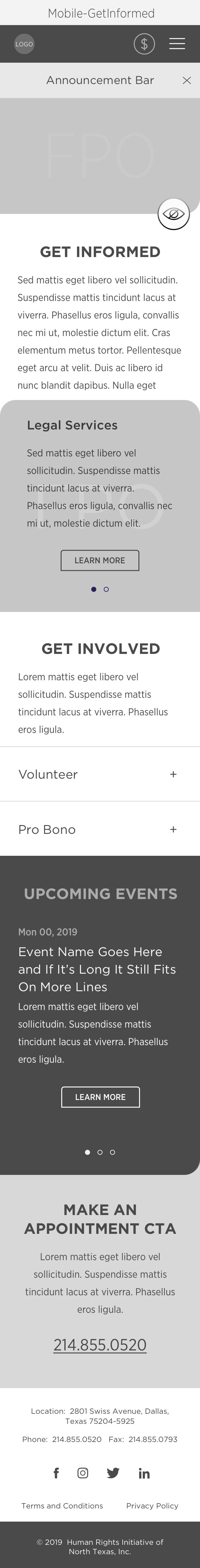
With user pain-points from a UX audit and UX/UI best practices, I reshaped HRI’s digital home base to create an accessible, content and navigation-friendly site. By establishing responsive design patterns and inclusive elements I highlighted online support and resources for multi-language use. Explore the new site for Human Rights Initiative.

Problems
○ Lacking UX/UI standards (simple navigation/footer; responsiveness; clean layout; intuitive user flows; and minimal content)
○ Monotonous and outdated design
○ No option for changing the language of the site


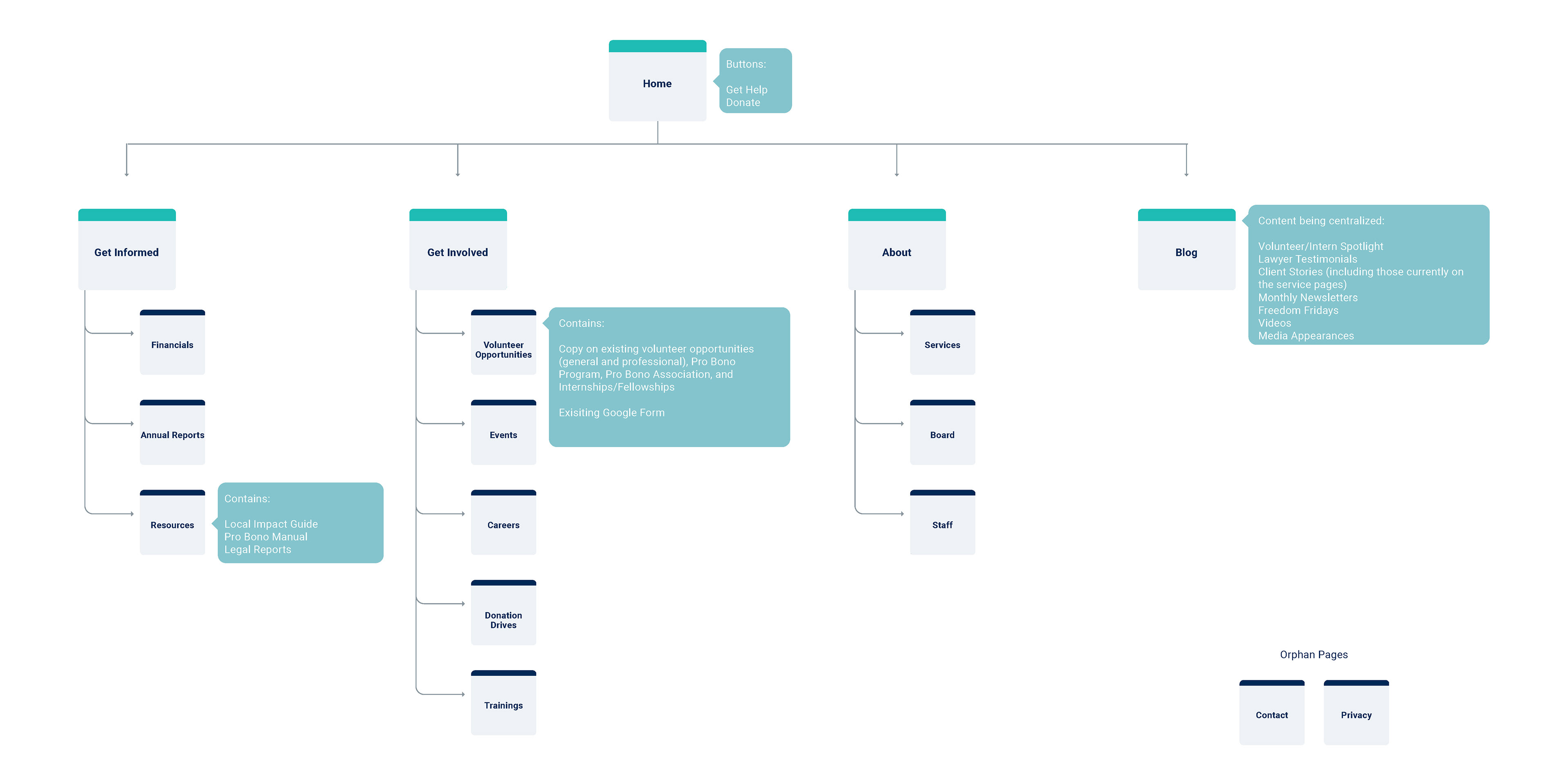
My Role + The Team
As the lead UI/UX designer, I was to analyze UX research and standards to design a heuristic site and complementary photography style.
Creative Director: Keisha Whaley, Brass Tacks Collective
Project Manager: Cece Rockwell, Brass Tacks Collective

Research
○ Hierarchy based on importance/urgency
○ Donation page requirements for official foundations/institutions (3rd party plugins)
○ Language swap functionality for various users
○ Photography and illustration study
○ Donation page requirements for official foundations/institutions (3rd party plugins)
○ Language swap functionality for various users
○ Photography and illustration study

Concept/Solution
A Deserving Welcome.
To complement the rebranding concept, this site design shows a balance between colors that welcome people of all cultures and visuals of life and community with:
✔ Distinct primary and secondary page layouts
✔ High-level nav buttons for urgent needs
✔ Static footers for easy access to support/events
✔ Color-assigned content sections for pattern recognition
✔ Grayscale photography to reduce color overwhelm
✔ High-level nav buttons for urgent needs
✔ Static footers for easy access to support/events
✔ Color-assigned content sections for pattern recognition
✔ Grayscale photography to reduce color overwhelm