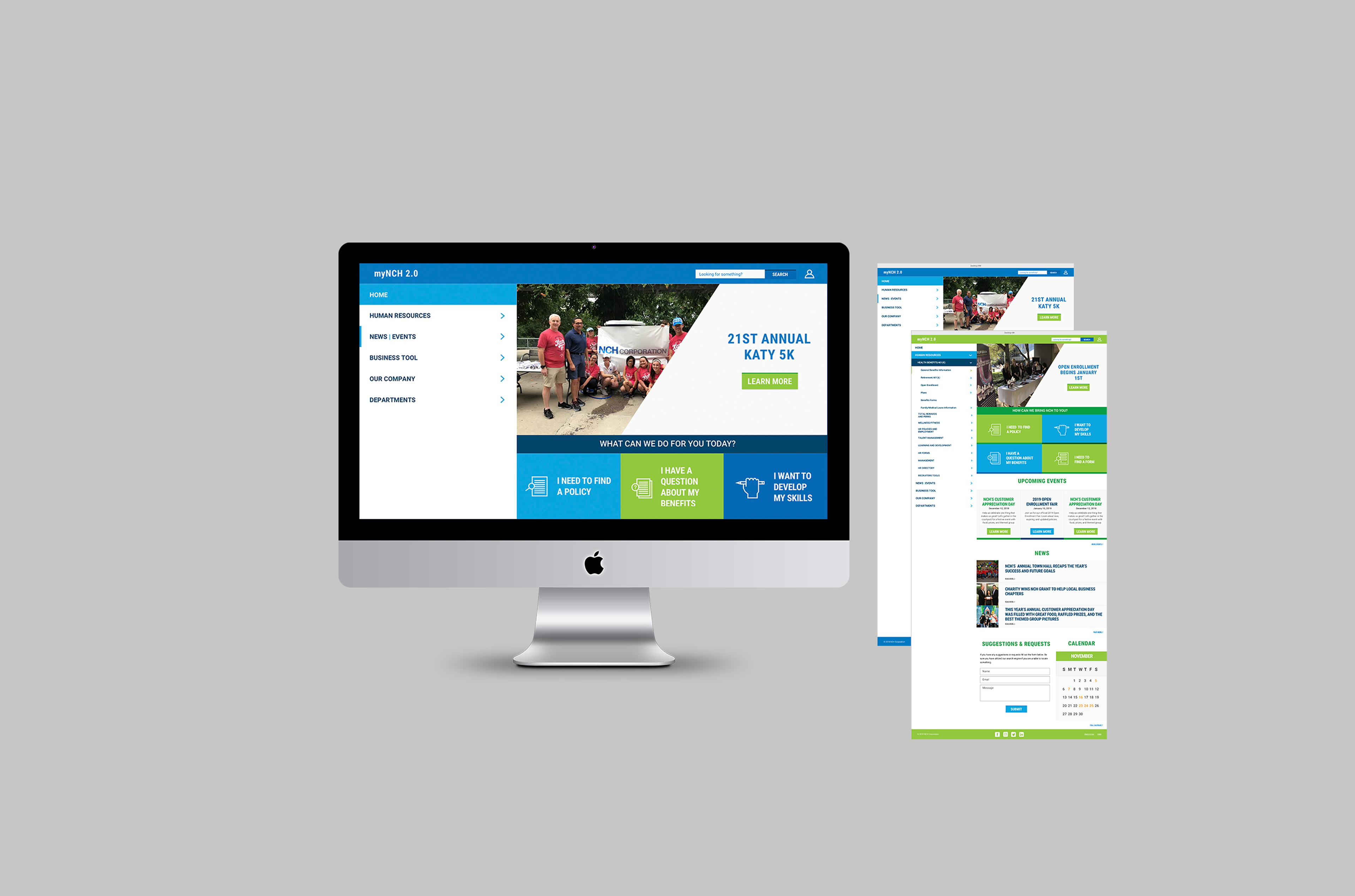
NCH Corporation Web App
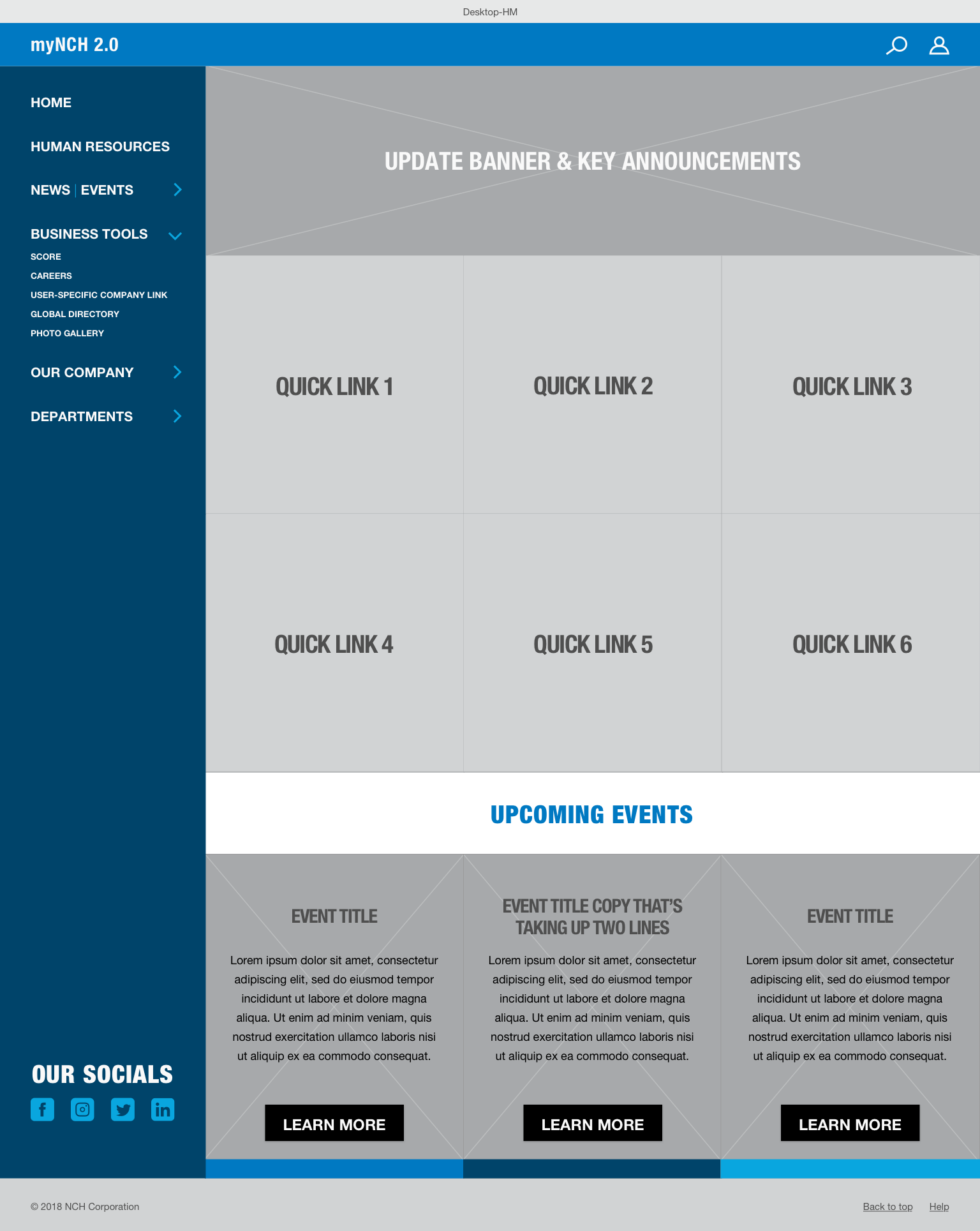
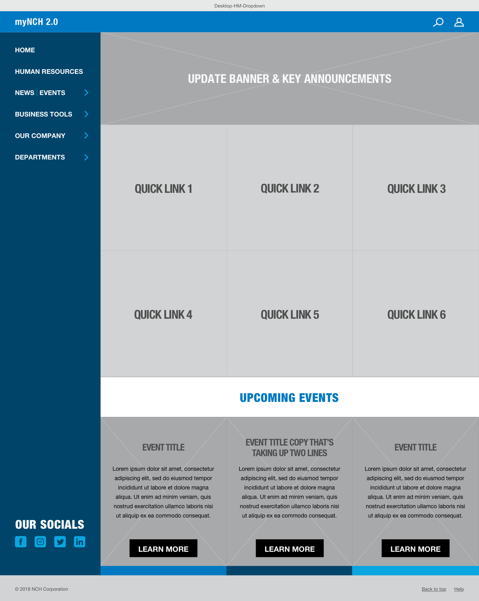
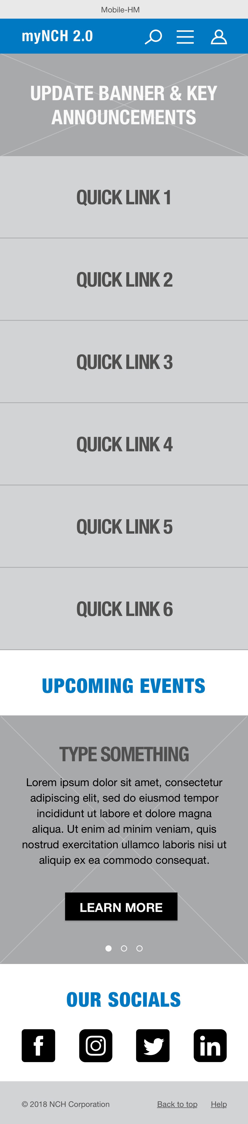
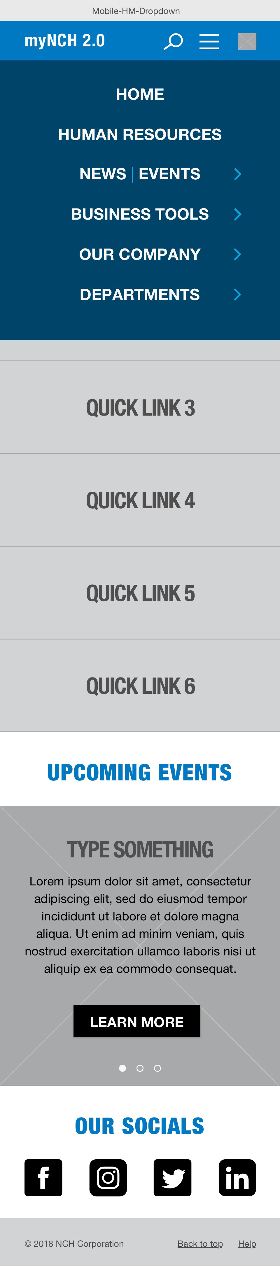
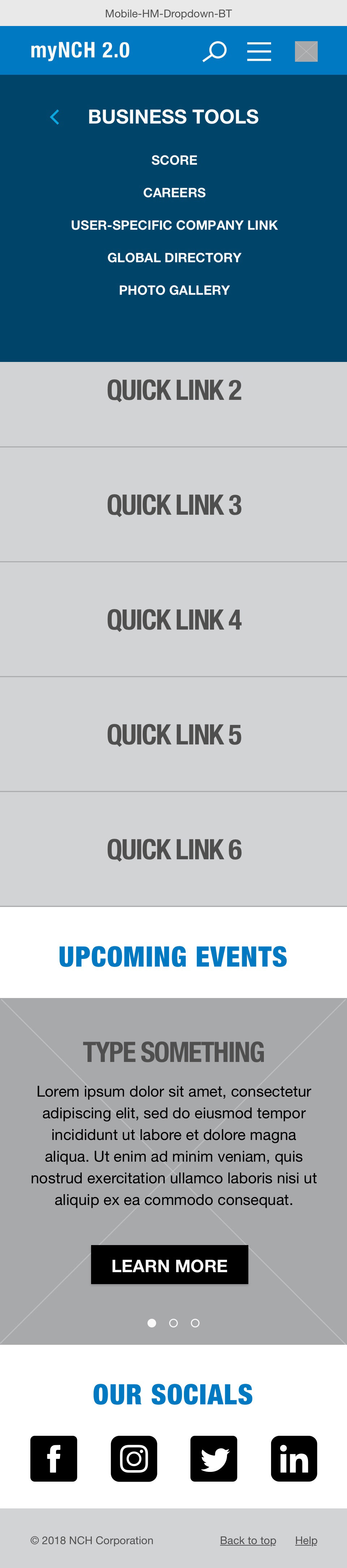
Heading the revamp for NCH's online portal, I analyzed competitive research, and user feedback to identify pain-points. After finding ways to solve key issues, I created a responsive modular site featuring color-coded departmental pages and navigation to assist with content overload and complex navigation.

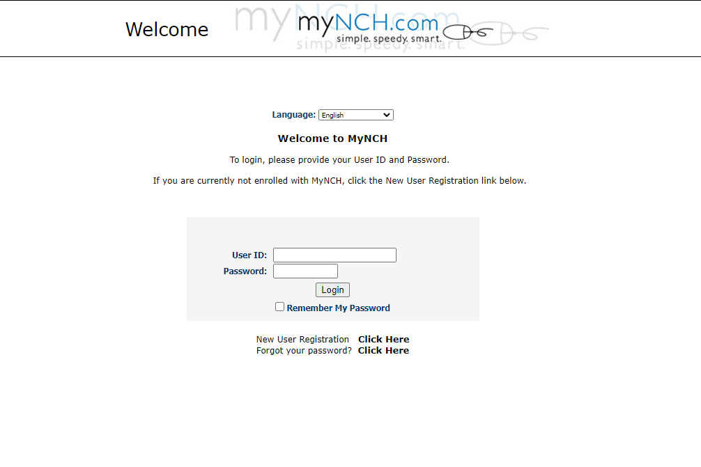
Problems
○ Lack of NCH branding
○ Awkward usage of digital real estate
○ Overwhelming and complicated navigation
○ Lack of visual direction and inconsistent layouts
○ Ineffective responsive functionality/layout
○ Awkward usage of digital real estate
○ Overwhelming and complicated navigation
○ Lack of visual direction and inconsistent layouts
○ Ineffective responsive functionality/layout

My Role + The Team
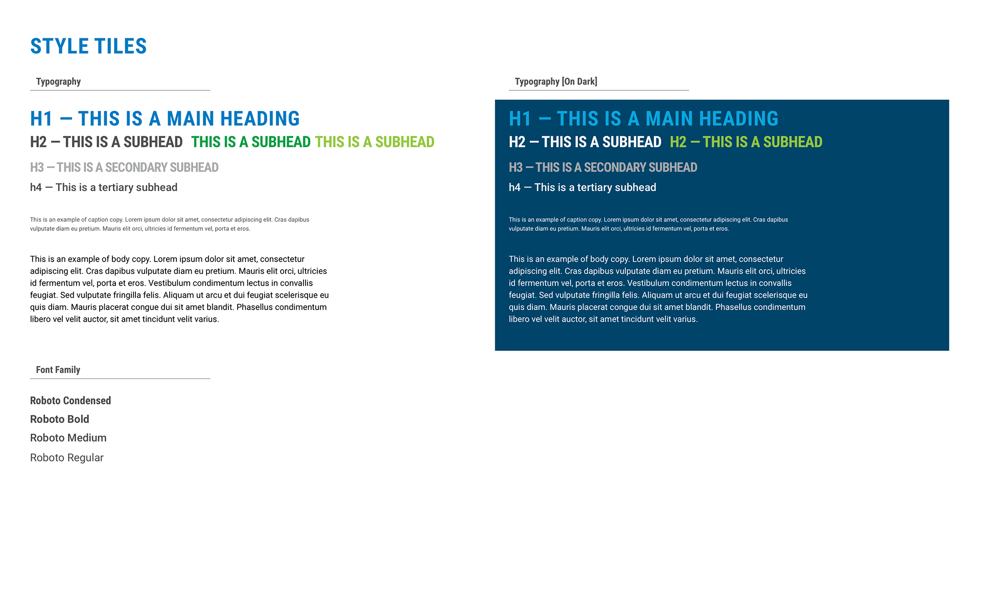
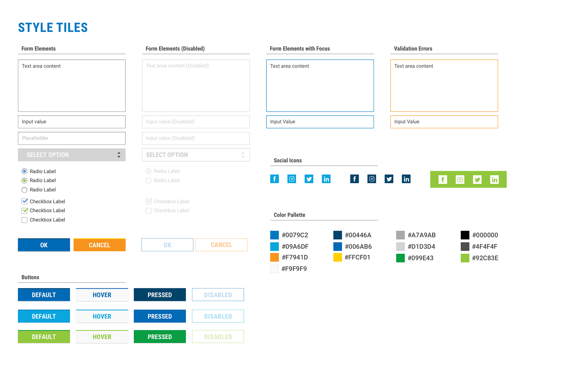
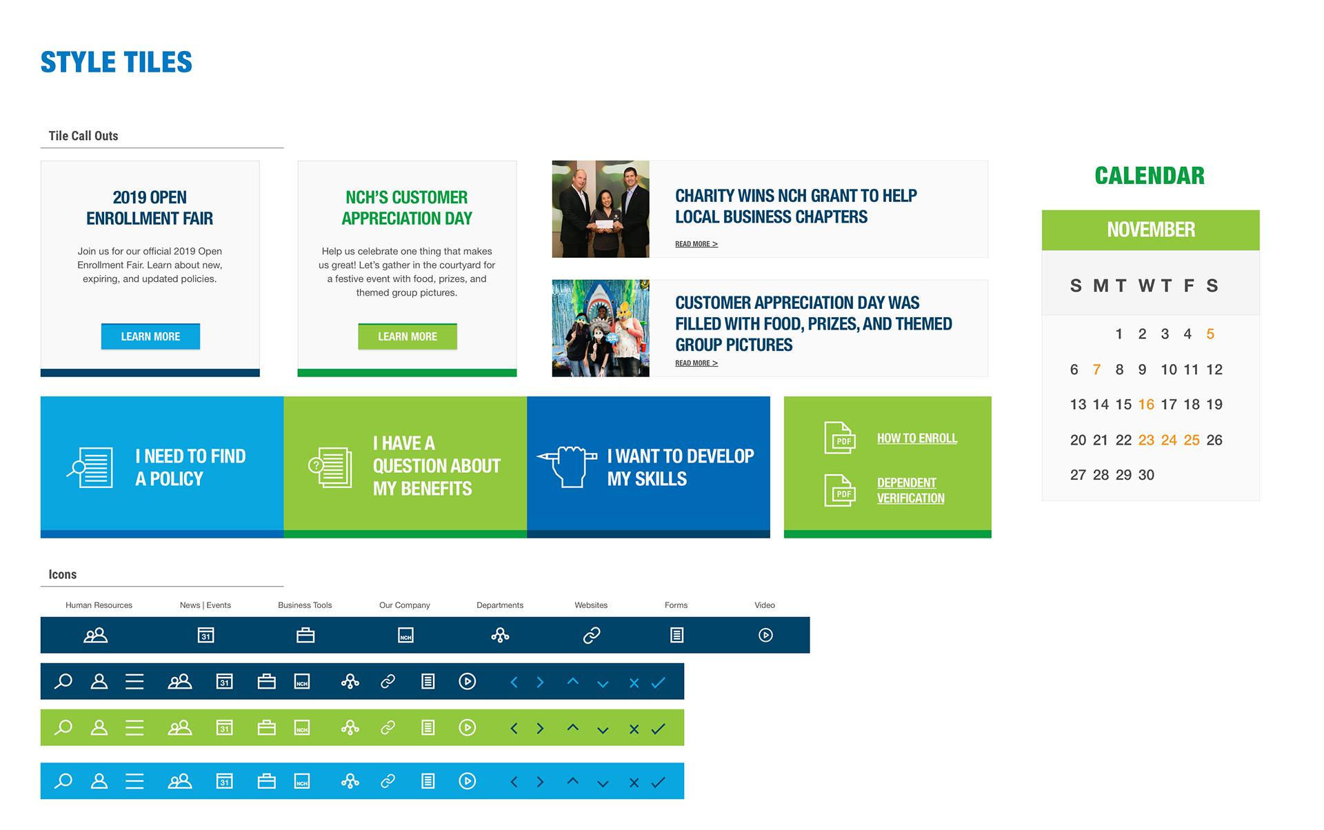
As the lead UI designer, I revamped the layout to create a modular system for page customization/responsiveness and extended the branding palette to complement it.
Creative Director: Keisha Whaley, Brass Tacks Collective
Project Manager: Cece Rockwell, Brass Tacks Collective
Project Manager: Cece Rockwell, Brass Tacks Collective

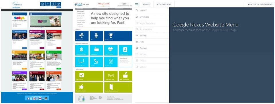
Research
○ Other branded portals and complex menus
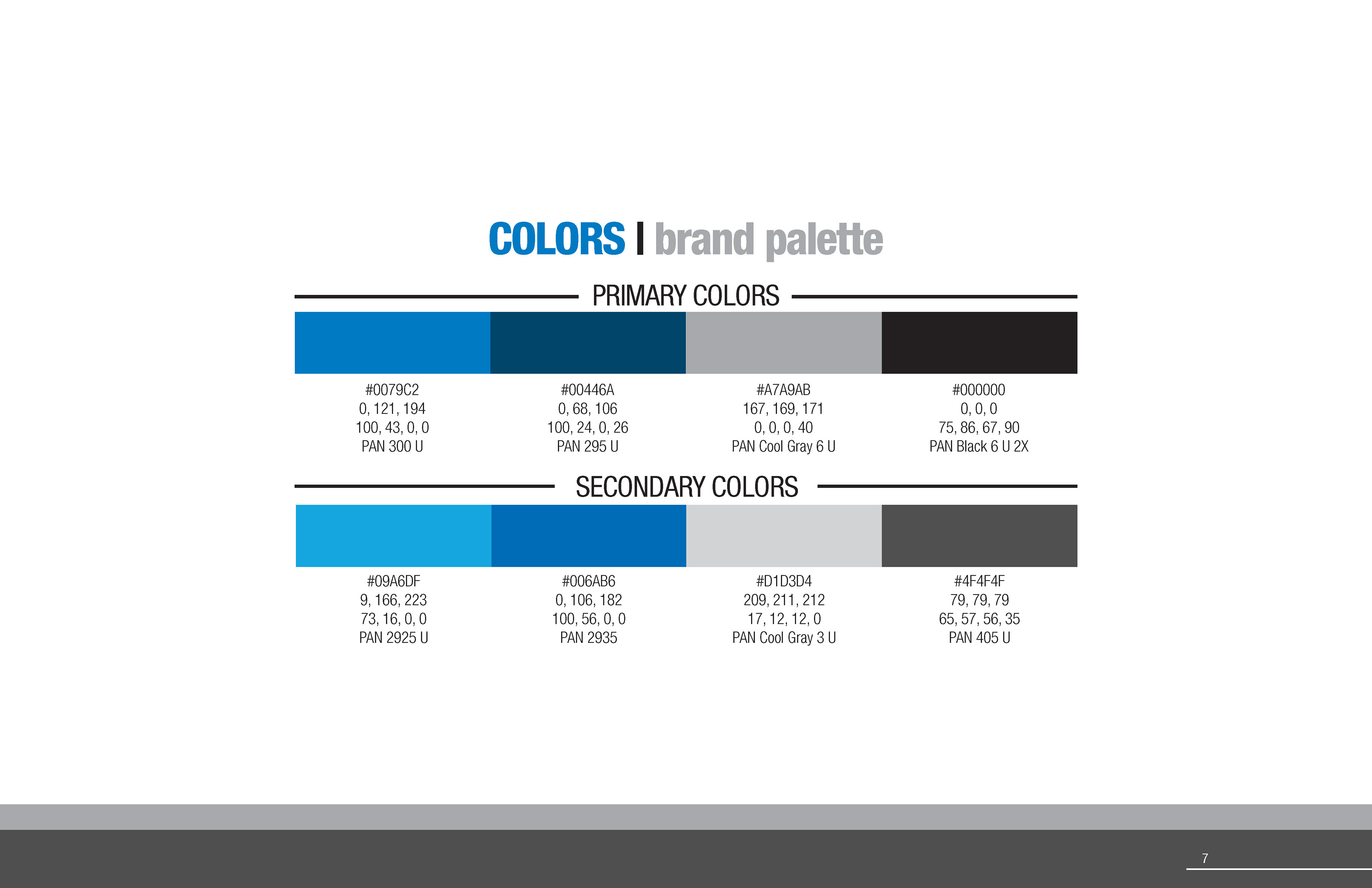
○ Color theory study to find the best colors to complement the NCH Corporation branding
○ Portal responsiveness from desktops to tablet screens
○ Modular systems and column structures best suited for a modular layout
○ Color theory study to find the best colors to complement the NCH Corporation branding
○ Portal responsiveness from desktops to tablet screens
○ Modular systems and column structures best suited for a modular layout

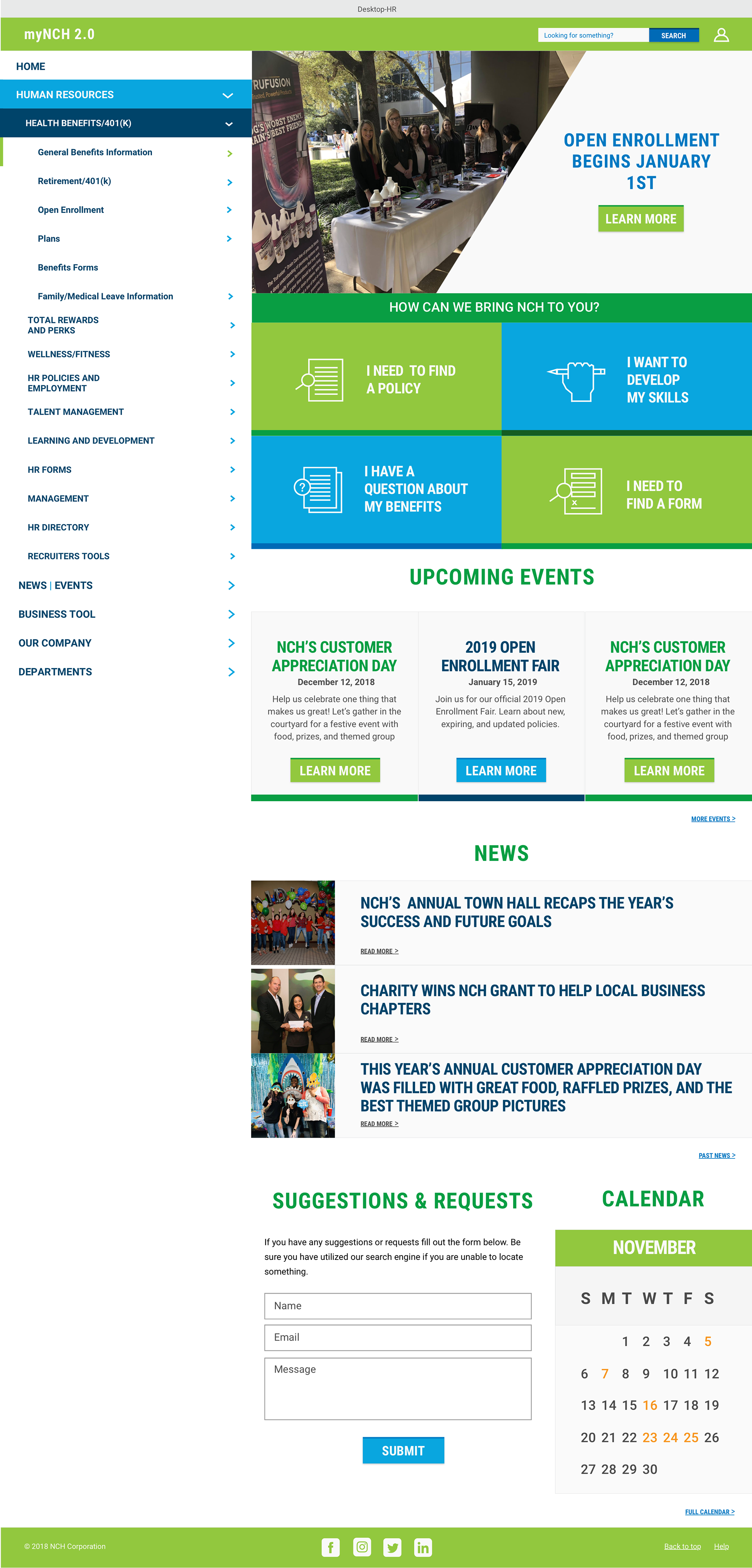
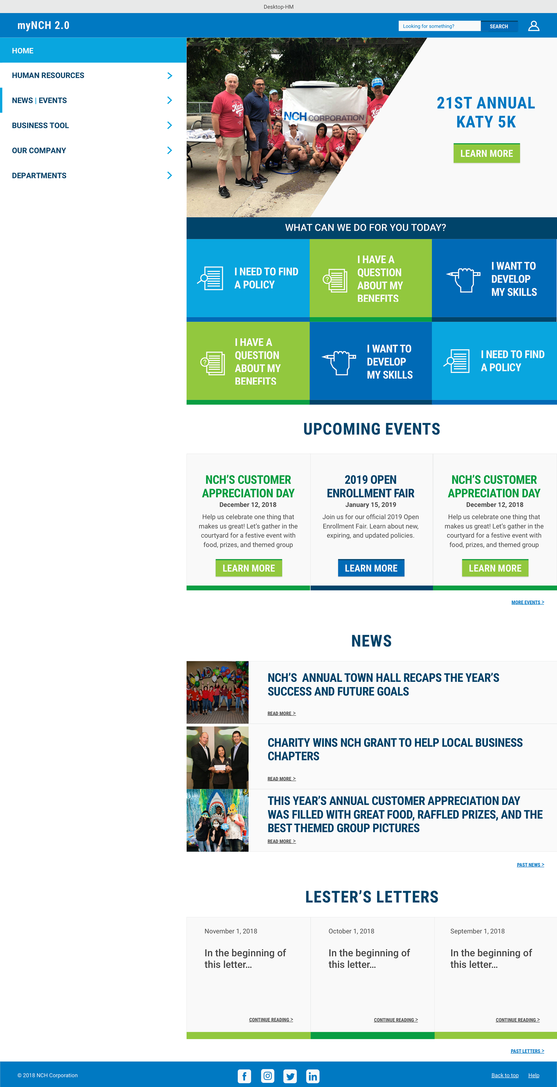
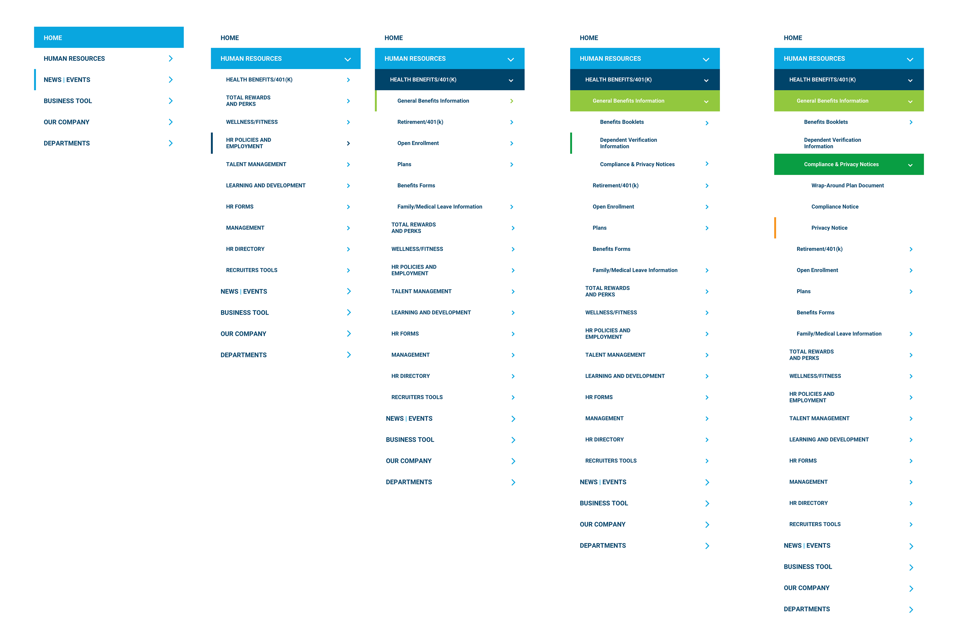
Concept/Solution
A 21st Century Update
✔ The highest priority was to give this platform a responsive customizable space that could be modified. Revamping their space into industry standards solved a lot of the user pain points including navigation and recognizing the difference between department pages and different sections of the site.
✔ The highest priority was to give this platform a responsive customizable space that could be modified. Revamping their space into industry standards solved a lot of the user pain points including navigation and recognizing the difference between department pages and different sections of the site.