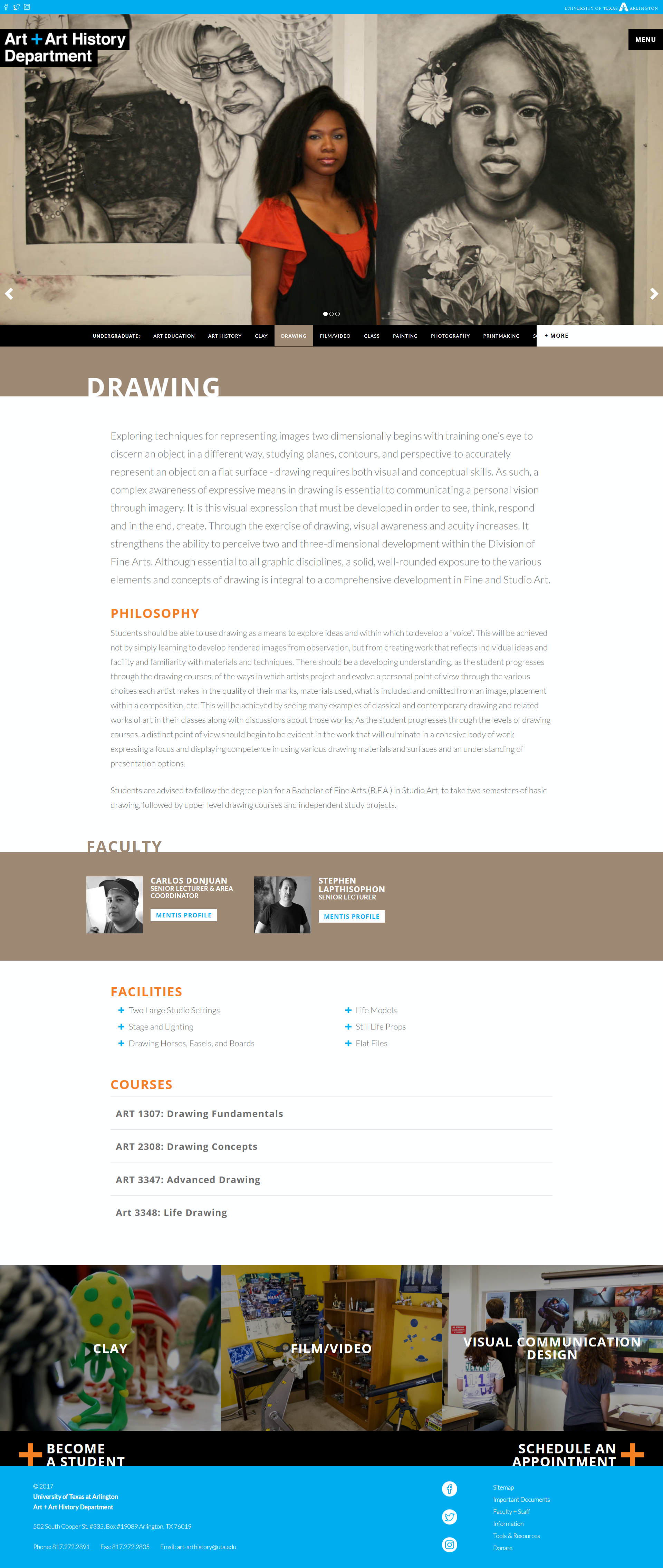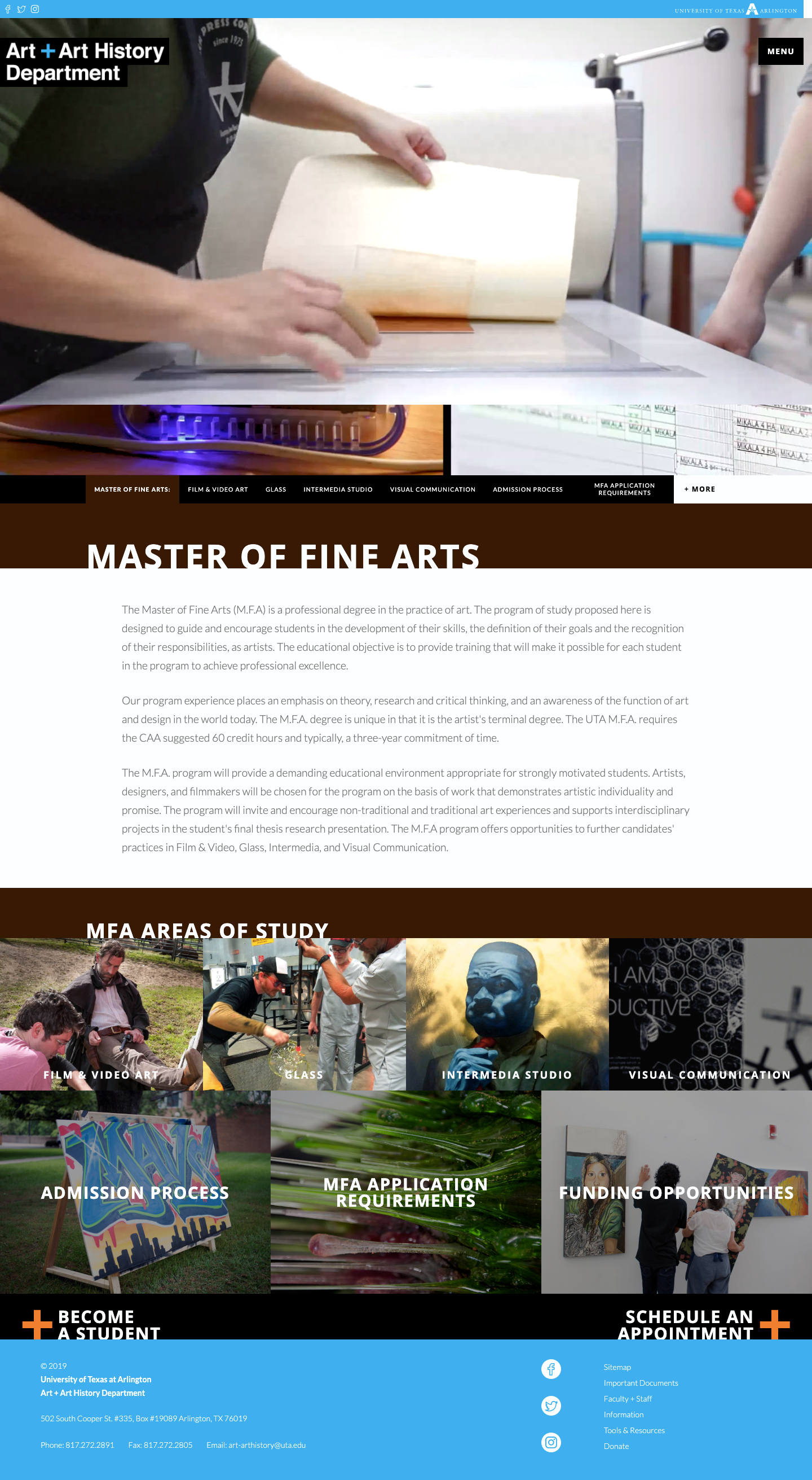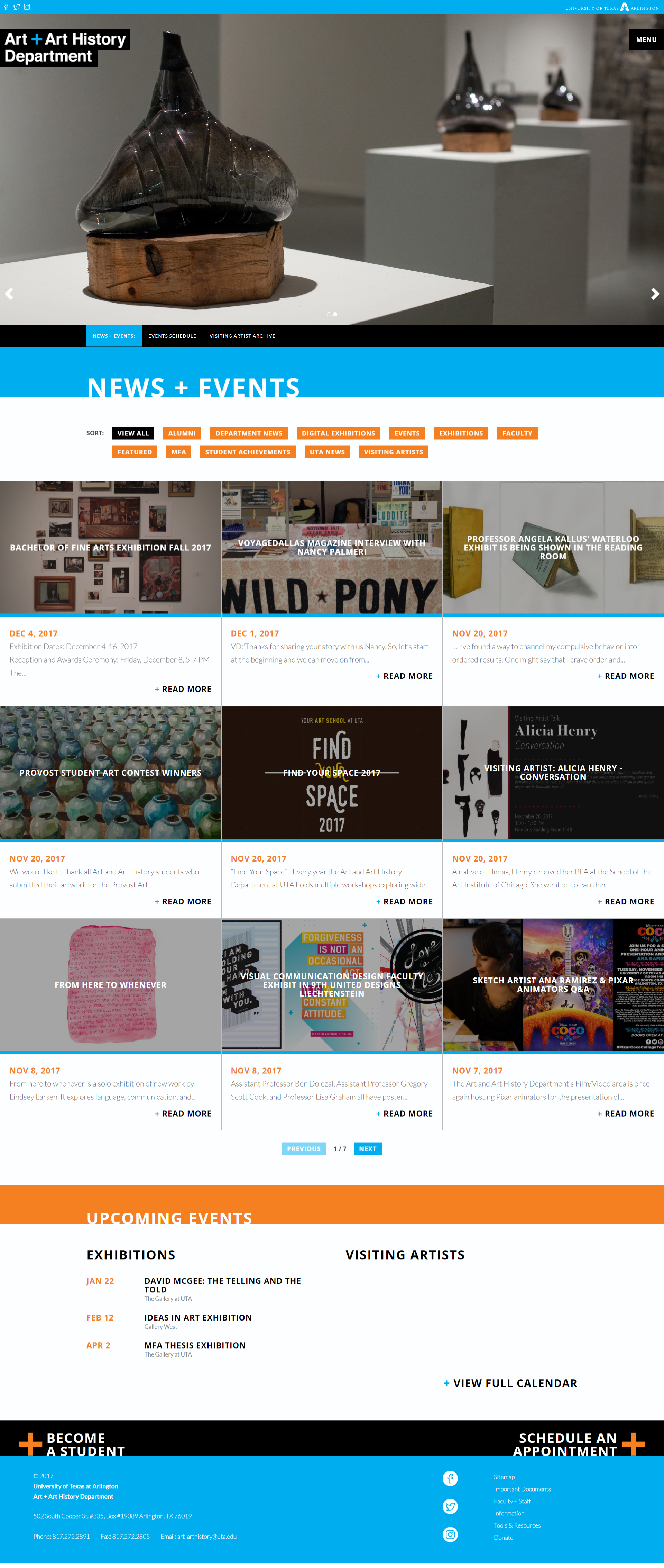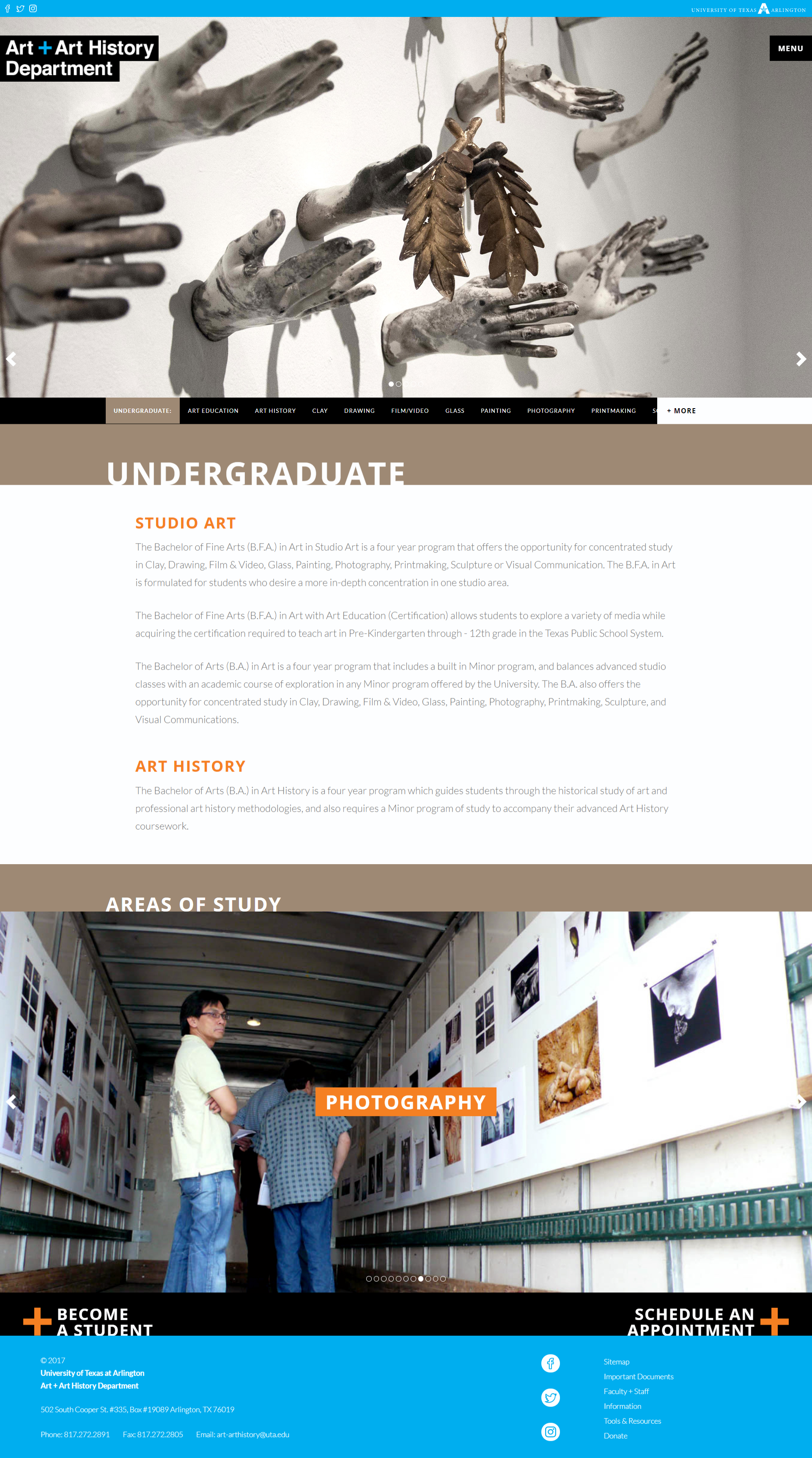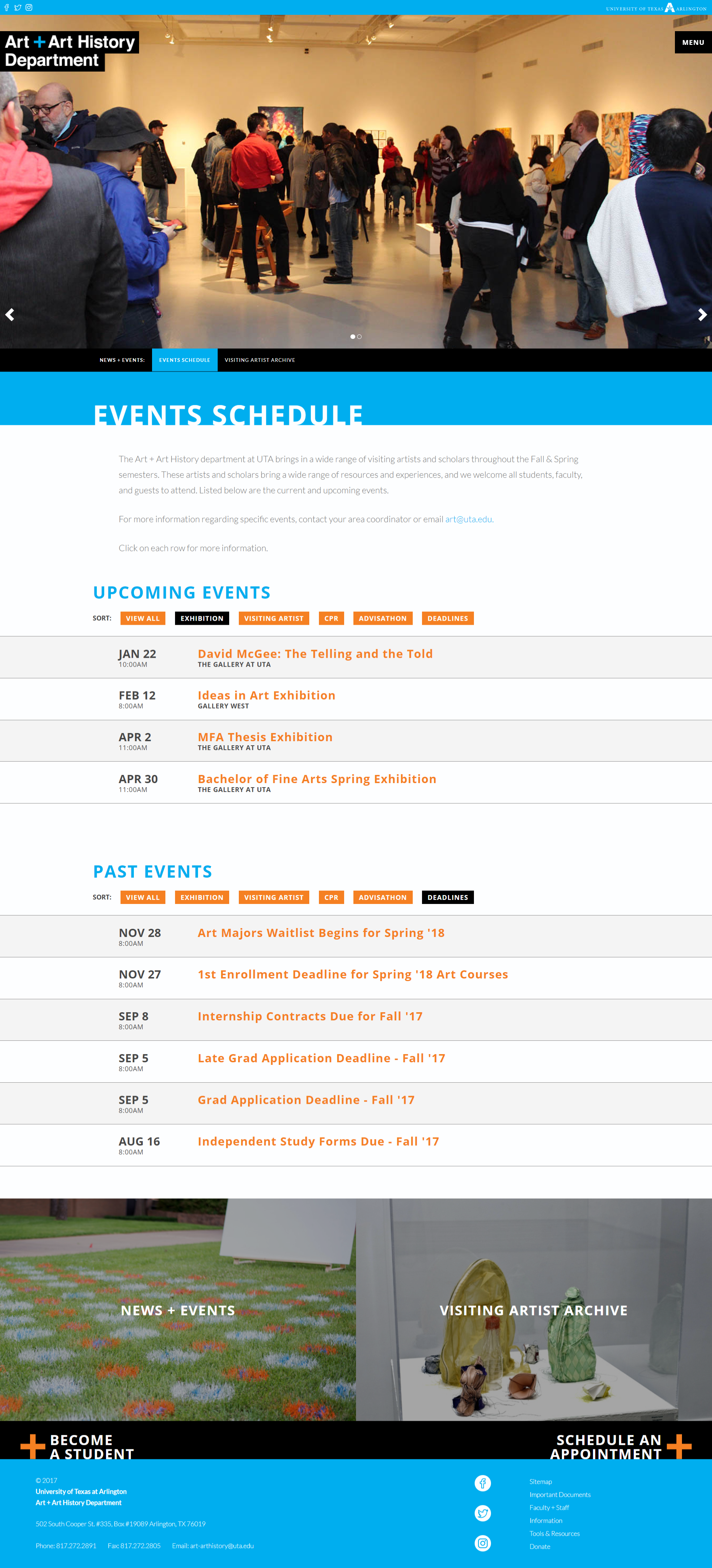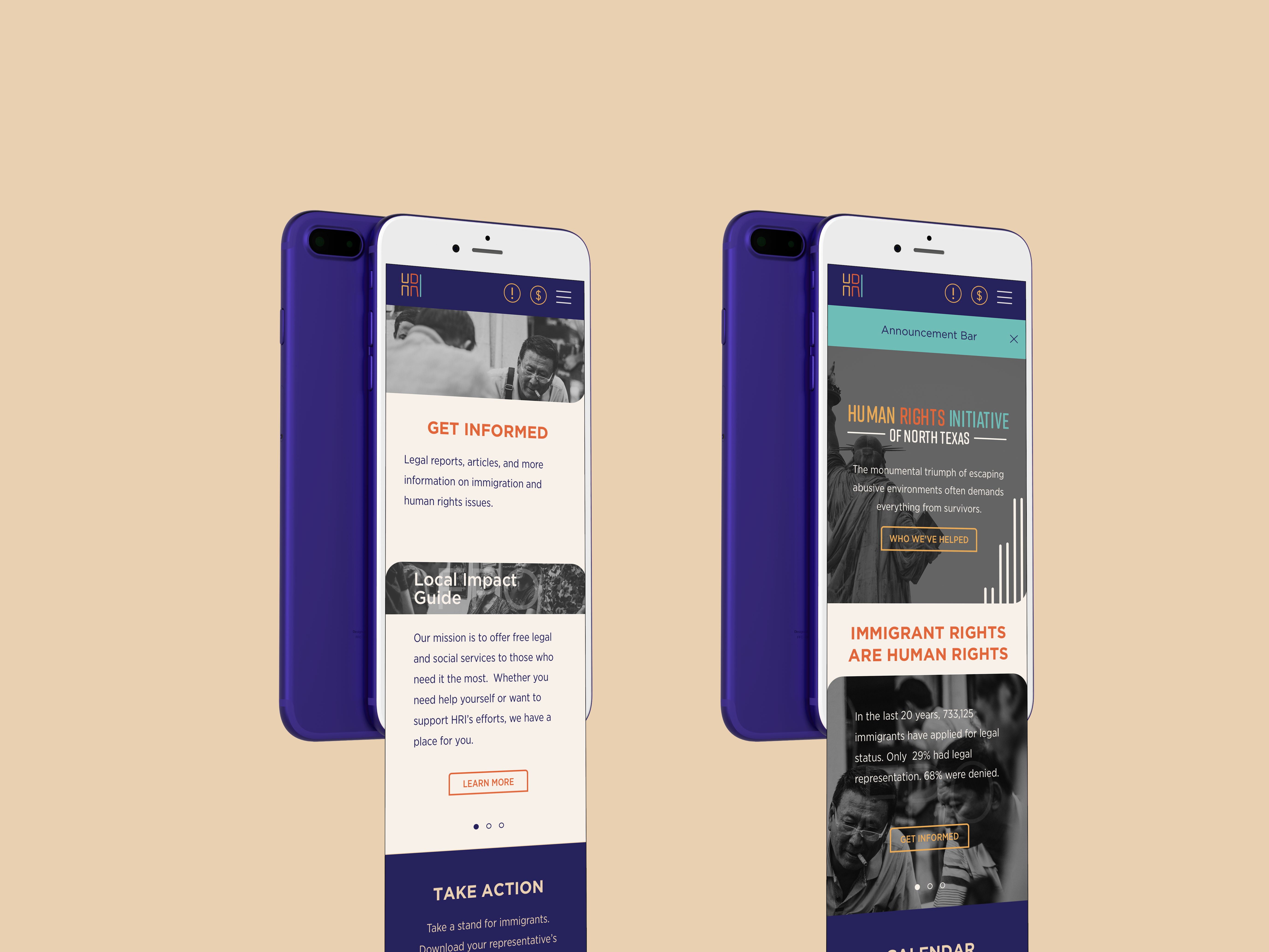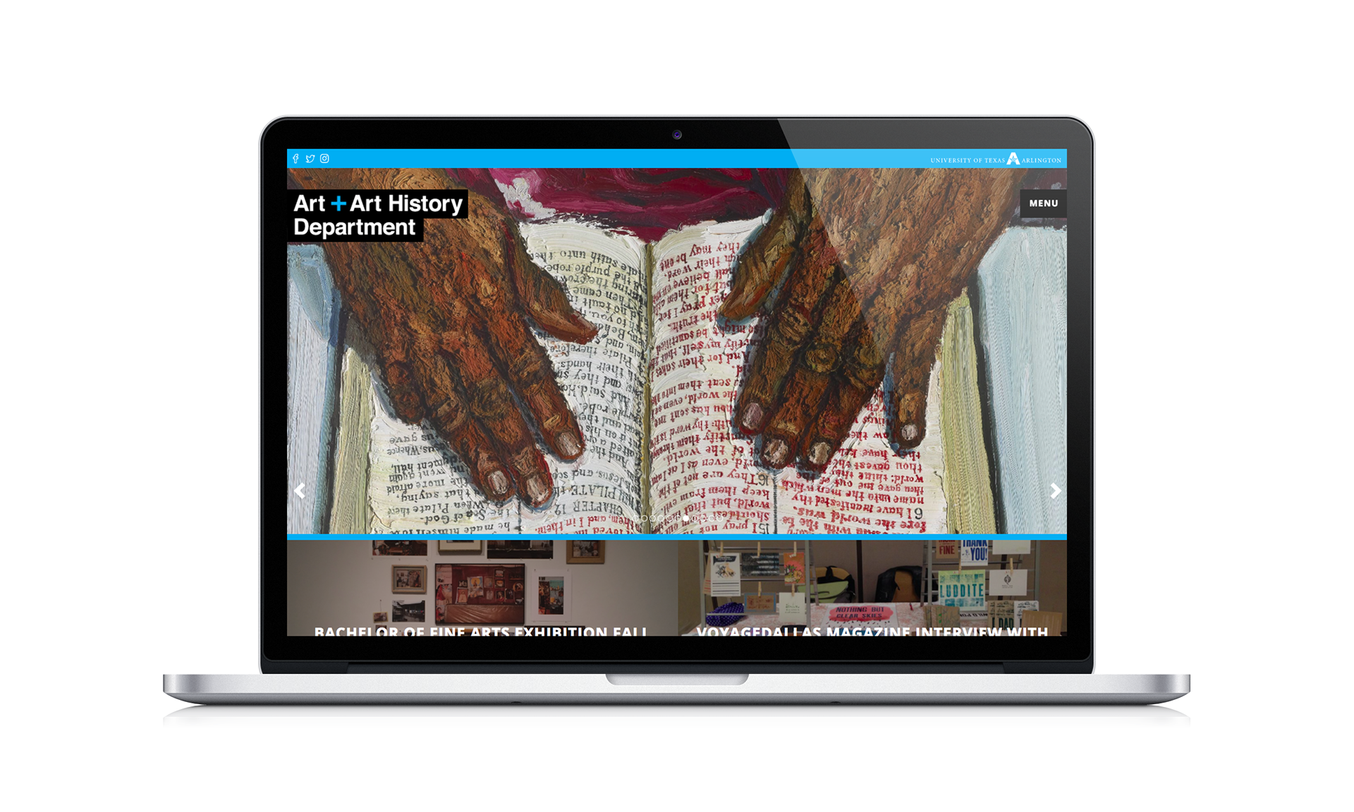
UTA A+AH Website
Heading the web design for the art and art history department, I kicked-off the design process with a competitive analysis, collegiate research, and user feedback. After much ideation to solve key issues, I created a branded modular site featuring color-coded student-level pages, refined navigation, and areas of study footers for smooth exploration.

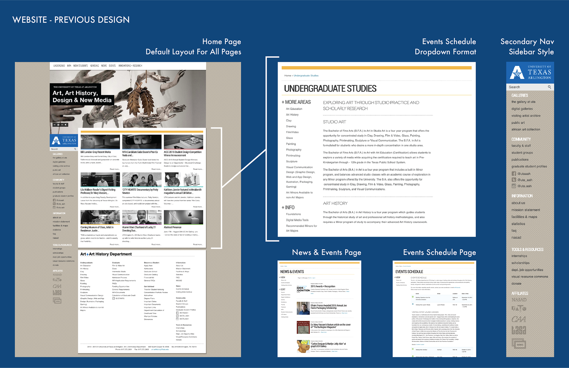
Problems
○ Outdated and non-branded look
○ Missed opportunities using digital real estate
○ Overwhelming navigation and user experience
○ Lack of visual direction and hard-to-find needed information
○ Non-responsive functionality/layout
○ Missed opportunities using digital real estate
○ Overwhelming navigation and user experience
○ Lack of visual direction and hard-to-find needed information
○ Non-responsive functionality/layout

My Role + The Team
As the department's graphic designer, I was to design the new departmental website plus various digital and print requests like flyers, event banners, posters, and more.
Department Chair: Robert Hower
Developer: Cosme Olivas
Department Chair: Robert Hower
Developer: Cosme Olivas

Research
○ Competitive analysis: Rocky Mt College of Art + Design, Art Institute of Chicago, Cranbrook Academy of Art, and more
○ Current UX standards (margins, hierarchy, column-and modular-based layout, and navigation)
○ Data around student and faculty needs, pain-points, and feedback
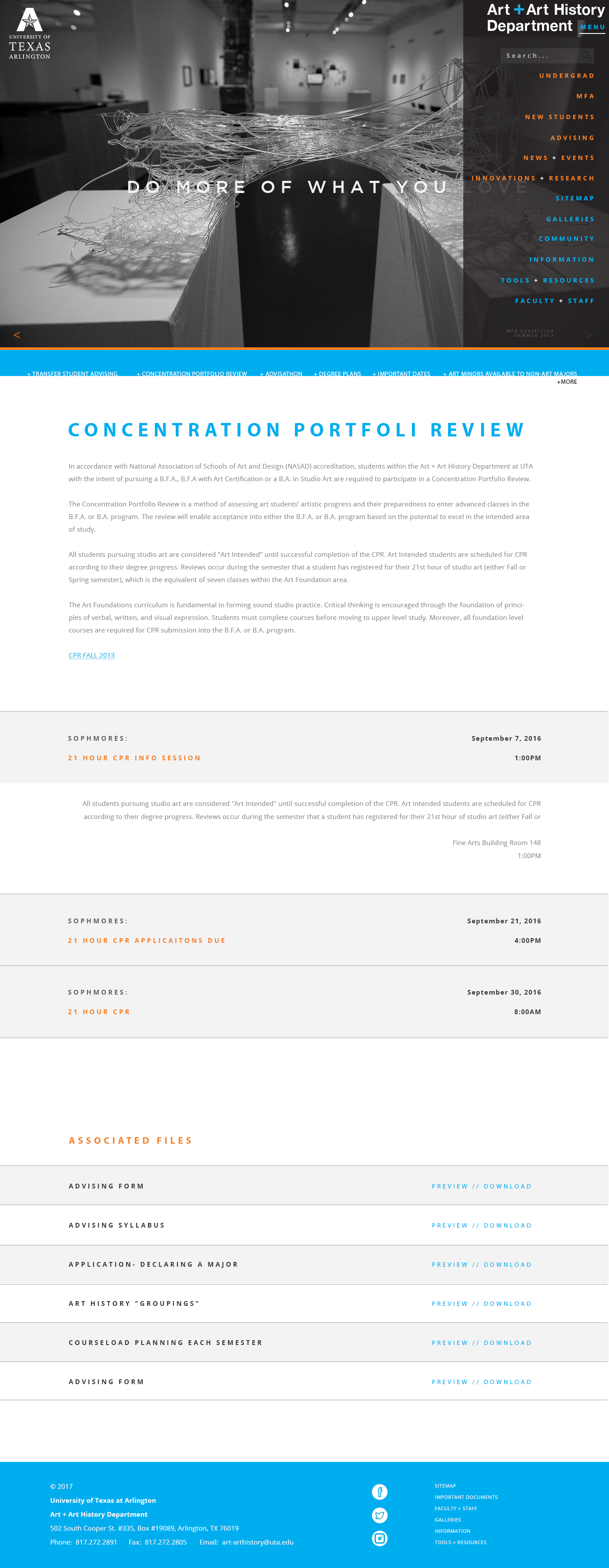
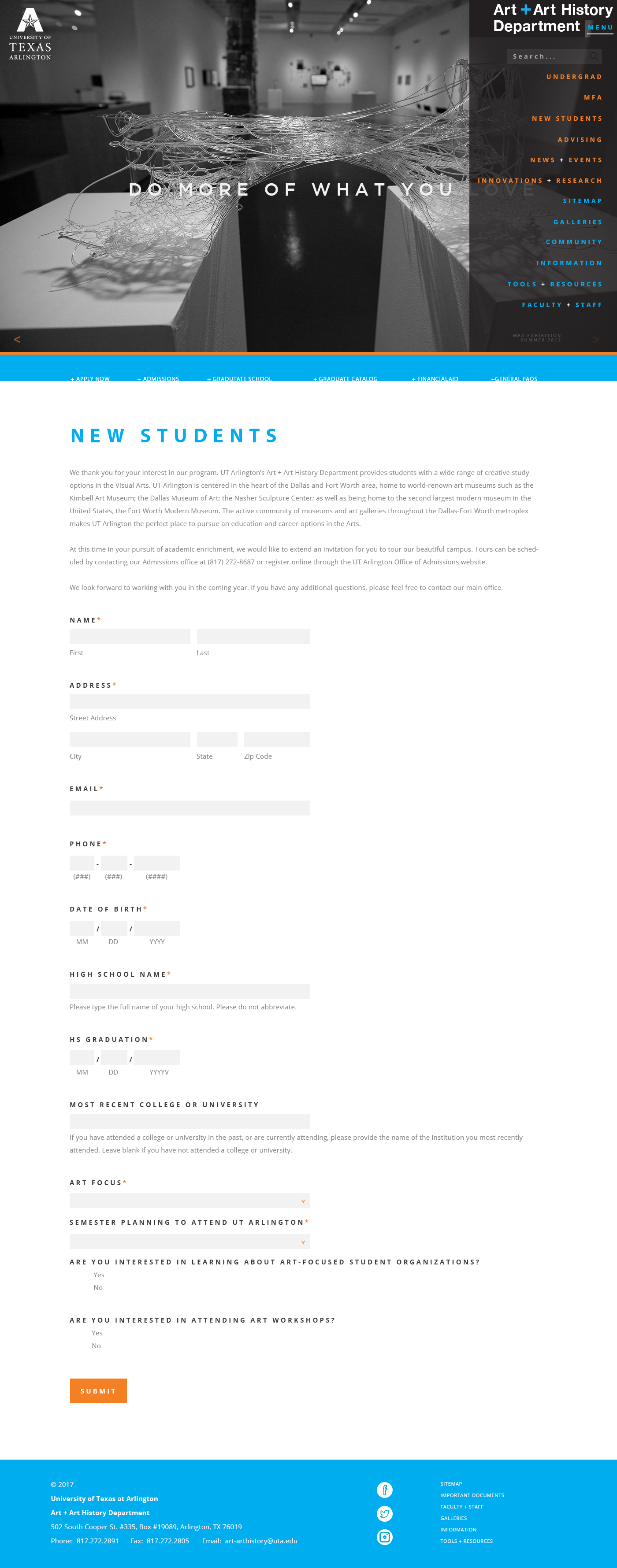
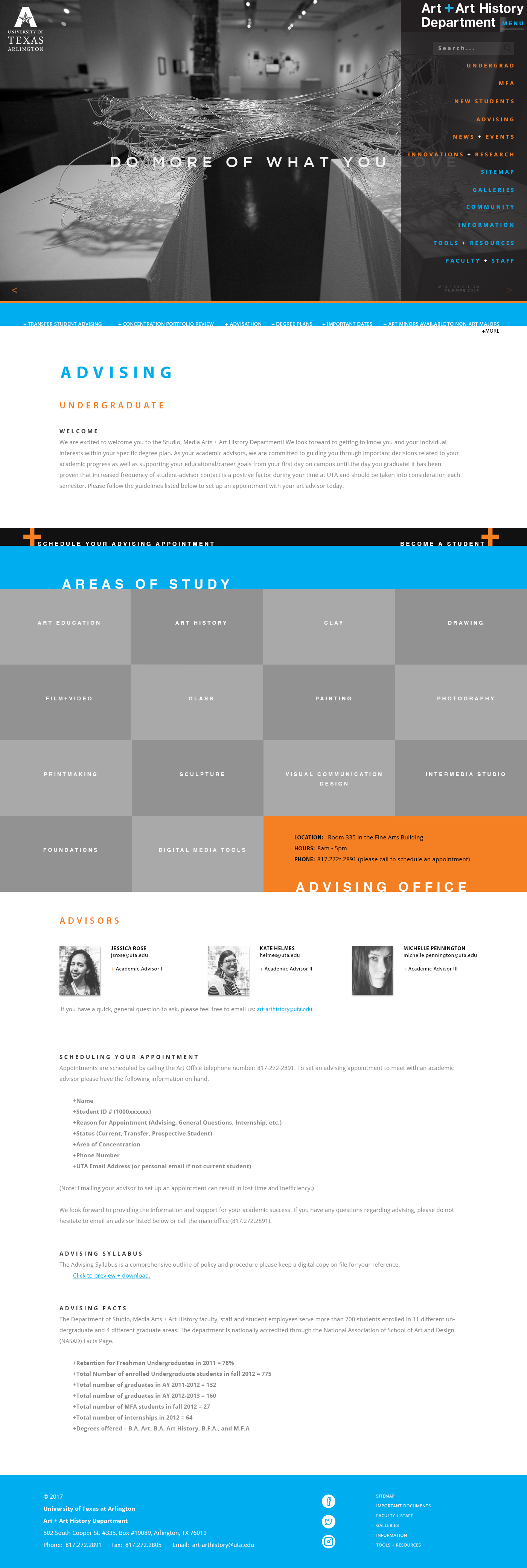

Concept/Solution
Household Recalibration
Aligning with the UTA’s official color palette allowed the expansion to:
✔ implement a system where visitors could dictate the difference between sections and student levels
✔ implement a system where visitors could dictate the difference between sections and student levels
✔ update navigation allowing links to other majors and extended menus to related pages
✔ create a content-specific design system for scanning for easy scanning